
To see in colour is a delight for the eye but to see in black and white is a delight for the soul
Andri Cauldwell
Colombia is one of the most colourful countries I’ve ever visited, possibly the most colourful. So it seems counter-intuitive to present it in black and white. Yet however colourful the destination there are always likely to be at least a few images that I feel merit experimentation. Ones in which form dominates the composition. Ones with strong contrasts and patterns. And sometimes ones where colours are muted or dull. Yes, even in Colombia I found some (just a few) colours dull!
Sometimes too a photo that worked very well in colour can also be successful in black and white; yes, even a flower! My feature photo is an edit of an image I used last week in my ‘In the pink’ post. Despite its beautiful colours I felt the high contrasts in the shot lent themselves to experimentation in my favourite Silver Efex Pro software, and I was happy with this result.
I used the same software for all the images below, some of which may well appear in their colour versions in future posts about Colombia. Where I’ve already used those colour versions, I’ve included a link. Today however I’m sharing them for Bren’s Midweek Monochrome (link to be added) and Leanne’s Monochrome Madness challenges.

La Manuela Hacienda, Pablo Escobar’s former holiday home on the Reservoir El Peñol-Guatapé
I featured the same building from a different angle in one of my ‘postcards‘ from Colombia
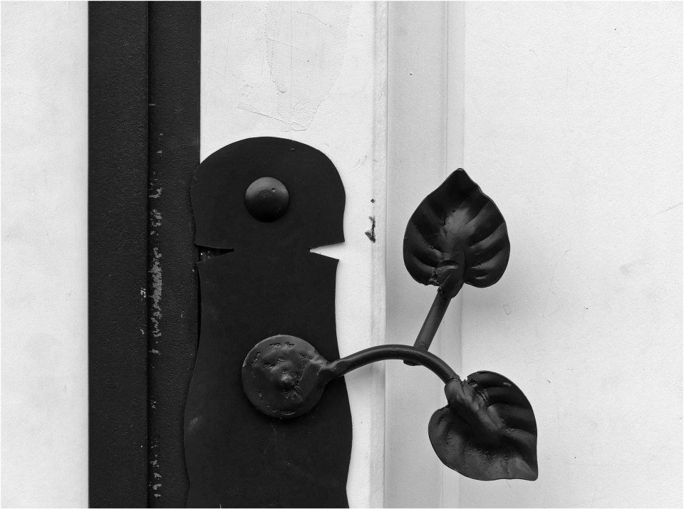
A door handle in Finlandia in Colombia’s coffee region

A lamp on a house in Villa de Leyva
There is a colour version of this shot in my post about the town, ‘A stroll around Villa de Leyva‘
A lamp on a house in Cartagena’s old city


A staircase in the Iglesia de San Pedro Claver, Cartagena
The Monumento a la Raza in central Medellín


In the Plaza Botero, Medellín
The colour version of this shot can be seen in my post about the work of Fernando Botero
The monument to Simon Bolivar at Puente de Boyacá, site of a famous battle in the struggle for Independence from Spain


A tree in Tayrona National Park

A palm tree at Cayena Beach Villas on the Caribbean coast

Driftwood at Cayena Beach

A street musician in Medellín
There’s a colour version on my Instagram account if you are interested
In Salento in the coffee region
Again, there’s a colour version on my Instagram account

I visited Colombia in February 2023


32 Comments
Wind Kisses
A more detailed look at Columbia in B&W. I like that you go back and forth to compare the differences. While I love the people shots, as I always do, the staircase sure creates curiosity.
Sarah Wilkie
That staircase was beautiful and I knew it would end up as a black and white shot as soon as I saw it. The others can work both ways so I’m glad you enjoyed seeing the comparisons 🙂
bluebrightly
The street musician and the palm fronds are standouts for me. Never stop experimenting. 🙂
Sarah Wilkie
Thank you 😊 I was pleased with how the musician came out, as it was just a grab shot in passing. I lucked out with the expression on his face!
Teresa
I wouldn’t think that such a place like Colombia would be good in b&w…but it really is. Great job Sarah
Sarah Wilkie
well, much of it wouldn’t be, but I managed to find some shots that worked 😀
wetanddustyroads
I learned, by looking at your black & white photos, to see the finer details. Monts ago, my immediate reaction was: “No, I like the colour photo more” … but you convinced me that sometimes even a B&W photo can be more beautiful 😉. I really like the staircase and driftwood on the beach.
Sarah Wilkie
Wow, I’m really pleased if I’ve helped you to appreciate an additional style of photography 😮😊 I hope you’ll start to find more B&W images to enjoy!
equinoxio21
Works very well indeed.
Sarah Wilkie
Thank you 🙂
Suzanne
Stunning collection, Sarah, especially the first one of the flower. I am a big fan of black and white photography, it makes the subject stand out more without colour as a distraction. I have a few B&W photos on our lounge wall.
Sarah Wilkie
Thanks so much Suzanne 😊 You’ve just proved how subjective this photography thing is! I too was happy with the flower, although I like it in colour too, but see the comment from Yvonne below – she isn’t keen on B&W for nature shots.
grandmisadventures
I love that leaf door handle! I wonder if I could put something like that in my house somewhere
Sarah Wilkie
It’s gorgeous isn’t it? They really love to ornament their doors in Colombia. I’m planning a whole post just about the door knockers in Cartagena!
grandmisadventures
oh that will be lovely to see- looking forward to the door knocker post!
Leanne Cole
They look fantastic.
Sarah Wilkie
Thank you Leanne 🙂
Rose
The hibiscus, horse, and tree roots look so soft, I can hardly resist reaching out to touch them. The black and white effect seems to have softened those images, at least to my eye.
Sarah Wilkie
That’s an interesting perspective, especially on the tree which I thought of a strong and very solid when I spotted it. Maybe as you say the B&W edit has softened it 🙂
thehungrytravellers.blog
That staircase looks almost as if it’s carved into snow it’s so pure and white. Another terrific collection.
Sarah Wilkie
I see what you mean about snow 🙂 I did go a bit high key in my edit but it really was striking – creamy marble rather then white snow however.
Mike and Kellye Hefner
You did them justice in black and white, Sarah. My favorite is the staircase. I looks like you could climb right into peacefulness.
Sarah Wilkie
Thank you Kellye 😀 I loved that staircase – the balustrade felt so cool and smooth and I could just imagine the thousands of hands which have touched it over the centuries!
Yvonne Dumsday
Maybe I need more colour in my life, during these current grey, black and white days of prolonged winter but I do prefer to see (nature especially) in its full glory.
Sarah Wilkie
It’s great to see plenty of colour in the winter, I agree, but I also enjoy the way using monochrome brings out different aspects of a composition 🙂
Alison
The house definitely looked good in black and white. Love the stairs too, simple and elegant
Sarah Wilkie
Thank you Alison – both of those are examples of images I ‘saw’ in B&W at the time, even though I shot in colour 🙂
margaret21
This post came at just the right time for me, as the photo club I’ve just joined did a monochrome workshop last night. I’ve decided that, even though going to colourful Spain next week, I’m going to experiment far more with B/W, as the guy running the workshop, and you, have demonstrated how worthwhile it can be.
Sarah Wilkie
Oh yes, do experiment and share the results! I’m sure you were told this at the workshop but be sure to take the photos in colour and experiment later. It’s easy to turn colour shots into B&W ones but impossible to recreate the colours in a shot taken in B&W!
margaret21
On the contrary, Sarah, he said the exact opposite. He said go out prepared to take B/W all day. Until you’ve done this, he said, you will not appreciate what sort of things work in b/w, and what don’t. He also said that the kind of filter adjustments you might make are different for colour or b/w. He certainly had some cracking images, and I learnt all kinds of things about my camera about which I’d been completely unaware. So pro-tem, I’m going to follow his advice – after all, I can switch easily enough if it’s not working for me, and there’s always my phone,
Sarah Wilkie
Actually, that’s an interesting point. If you’re not used to ‘seeing in B&W’ it makes sense to go out expressly with that purpose and in that case you probably do need to set your camera on B&W so that what you see through the viewfinder is what you get. Once your eye is more used to assessing a scene the need to see it in B&W through the viewfinder becomes less and you can take it in colour even while knowing you’ll probably convert it, just in case you change your mind.
Also, I don’t use filters on my camera (I can’t be bothered carrying them around) and I find the in-camera filter effects lack subtlety, so I prefer to experiment with filters in post-editing. My Silver Efex Pro software doesn’t just convert to B&W, it also has loads of filters – different colours, vignettes, film type, sepia etc.
But yes, I think you have good advice from that workshop, at least as a starting point. Later you can decide on your preferred approach 🙂
margaret21
Absolutely! Until you know the rules, you can’t decide how and when to break them.